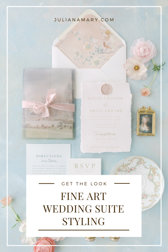
One of my favorite aesthetics to style is fine art. With delicate details, antique props, and layers of texture, my clients are thrilled to pull out all the stops. When it comes to styling fine-art flatlays, the key to the perfect layout is keeping the focus on the invitation suite and telling a beautiful story through thoughtful prop curation and attention to detail. Below are some of my tips for achieving a truly fine art aesthetic that isn’t overdone.
Select a Limited Color Palette
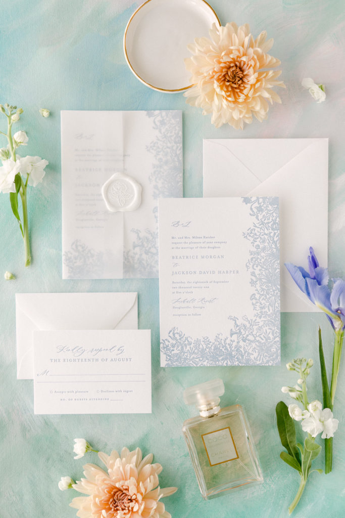
A fine art style is defined by its appealing aesthetic which, though creative, is typically simple, focused, and carefully edited. As a stationer, the key to an image that isn’t only beautiful but that will help potential clients know you are the right designer for their wedding is to keep the focus on your work. One way to keep your stationery as the highlight of the image is to stick to a limited color palette that supports your work without competing for attention.
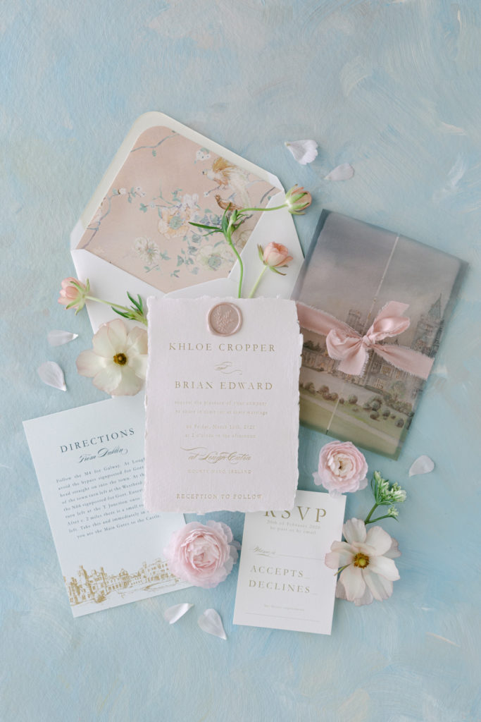
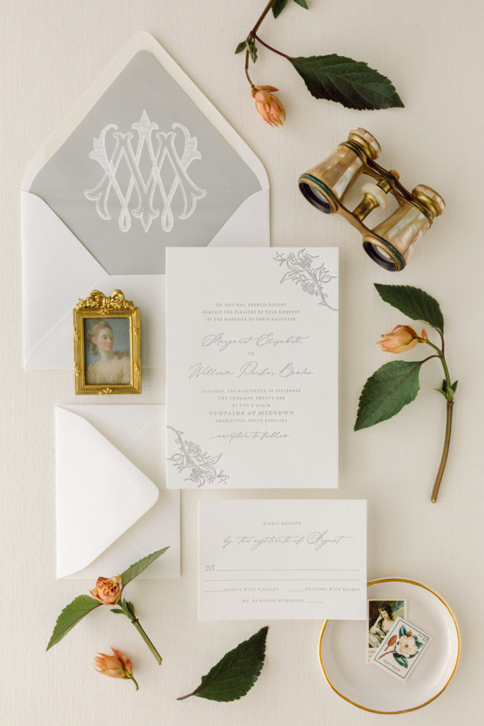
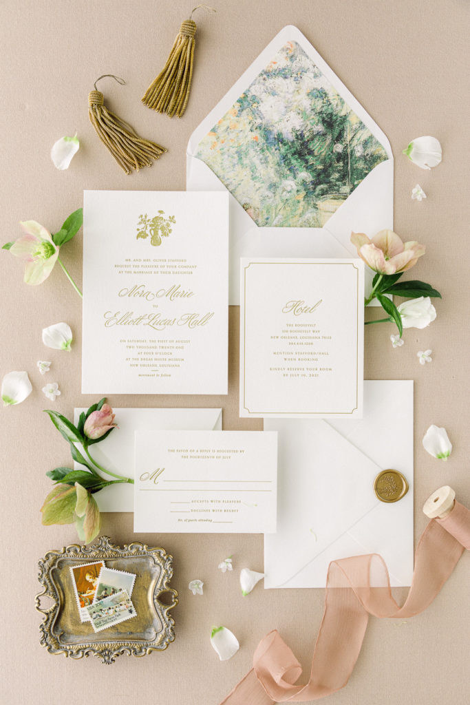
Use Texture
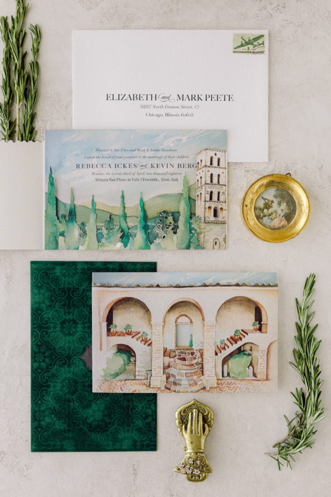
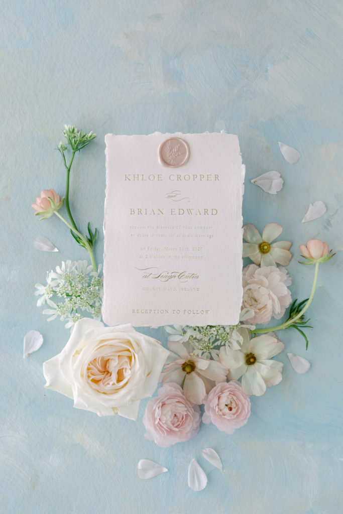
When styling stationery in a fine-art style, layering in texture through handmade backdrops, papers, and props effortlessly elevates the image and evokes old-world romance.
Curate Appropriate Props
The difference between a high-end flatlay that attracts luxury clients and one that just falls flat comes down to the props selected for the shoot. Being meticulous and thoughtful in your prop curation is essential. In addition to always creating a moodboard for each shoot, I think about the story behind the image – who is the couple, where are they getting married, what is important to their love story? Select props that tell a story, will connect with your dream clients, and above all, make sense in the image.
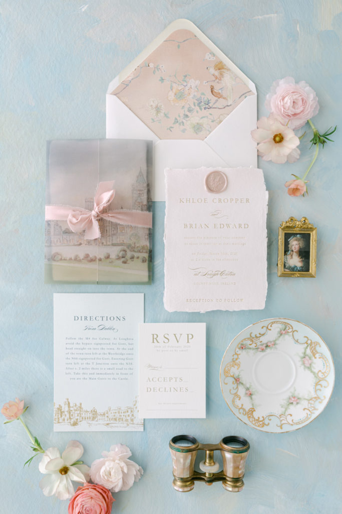
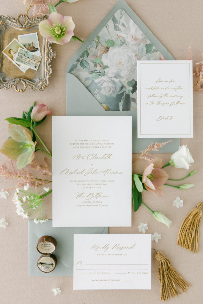
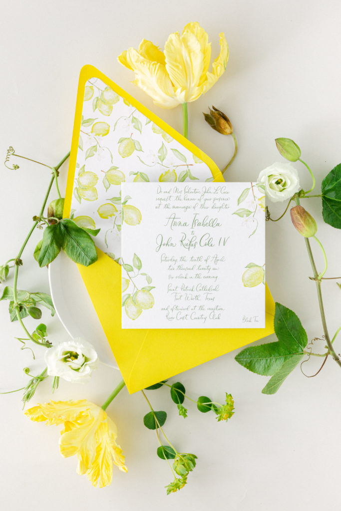
Final thoughts: Styling in a fine-art aesthetic isn’t right for every brand or business, but if your dream clients are high fashion luxury brides, having imagery that demonstrates you understand their aesthetic is essential to gaining their business.

liked this post? leave a comment!