Four Unbelievable Before and After Transformations
Relying on free styled shoots or wedding photographers to capture the beauty of your stationery is a risk you don’t want to be taking. Today I’m sharing four of my favorite before and after transformations; the difference is so shocking, you might wonder if they’re even the same stationery suites (spoiler – they are!)
Transformation #1
Before

On the left, this suite was shot at a real wedding and clearly as an afterthought.
After
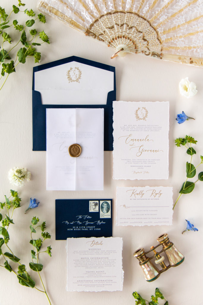
On the right, I’ve laid out the suite thoughtfully and paired with props that tell the story of the suite and the clients. All pieces are straight, in focus, and with true-to-life colors. Styling by Juliana Mary, Stationery by Brown Fox Creative
Transformation #2
Before
After
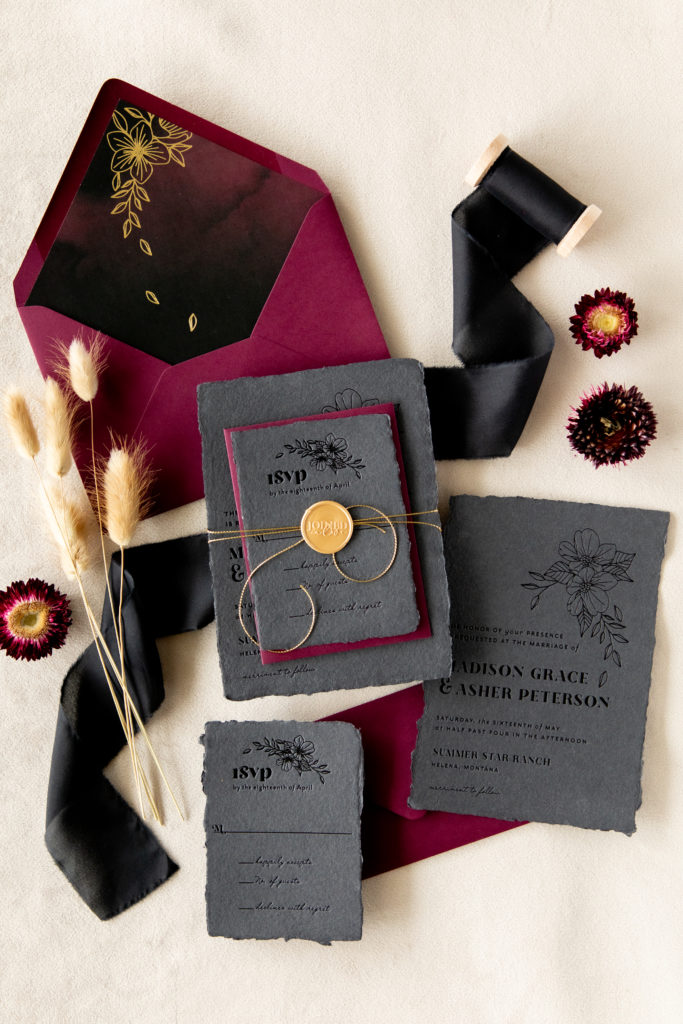
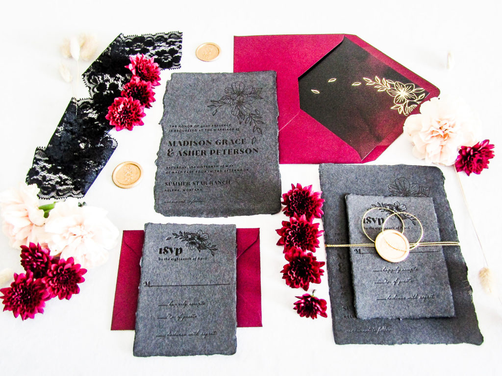
On the left, this suite was custom crafted for a free styled shoot with high hopes of using the images from the shoot on web and social media. The stationery is overexposed with confusing props that distract from the bespoke beauty of the suite.
On the right, the suite was styled to match the aesthetic of the styled shoot. With a focus on the invitation suite, the props are minimal but purposefully placed to lead the viewers eye through the image. The image was edited to show true-to-life colors and the gorgeous black-on-black foil and handmade paper. Styling by Juliana Mary, Stationery by Seventh & Anderson
Transformation #3
Before
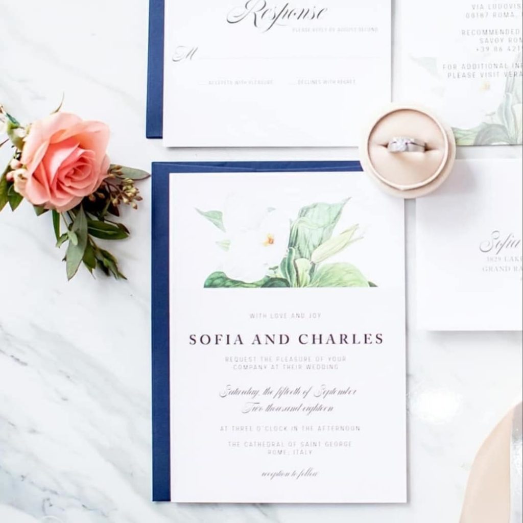
On the left, another free styled shoot gone awry! The suite isn’t well styled and the image is over-exposed and illegible.
After
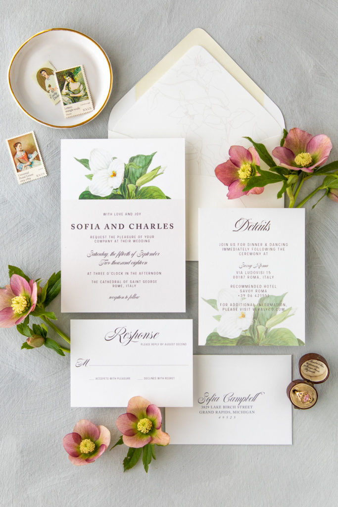
On the right, the image is clear, in focus, and styled thoughtfully to engage the viewer, inviting them to look longer. The colors are crisp and the subtle color differences are evident. Styling by Juliana Mary, Stationery by Veraly & Company
Transformation #4
Before
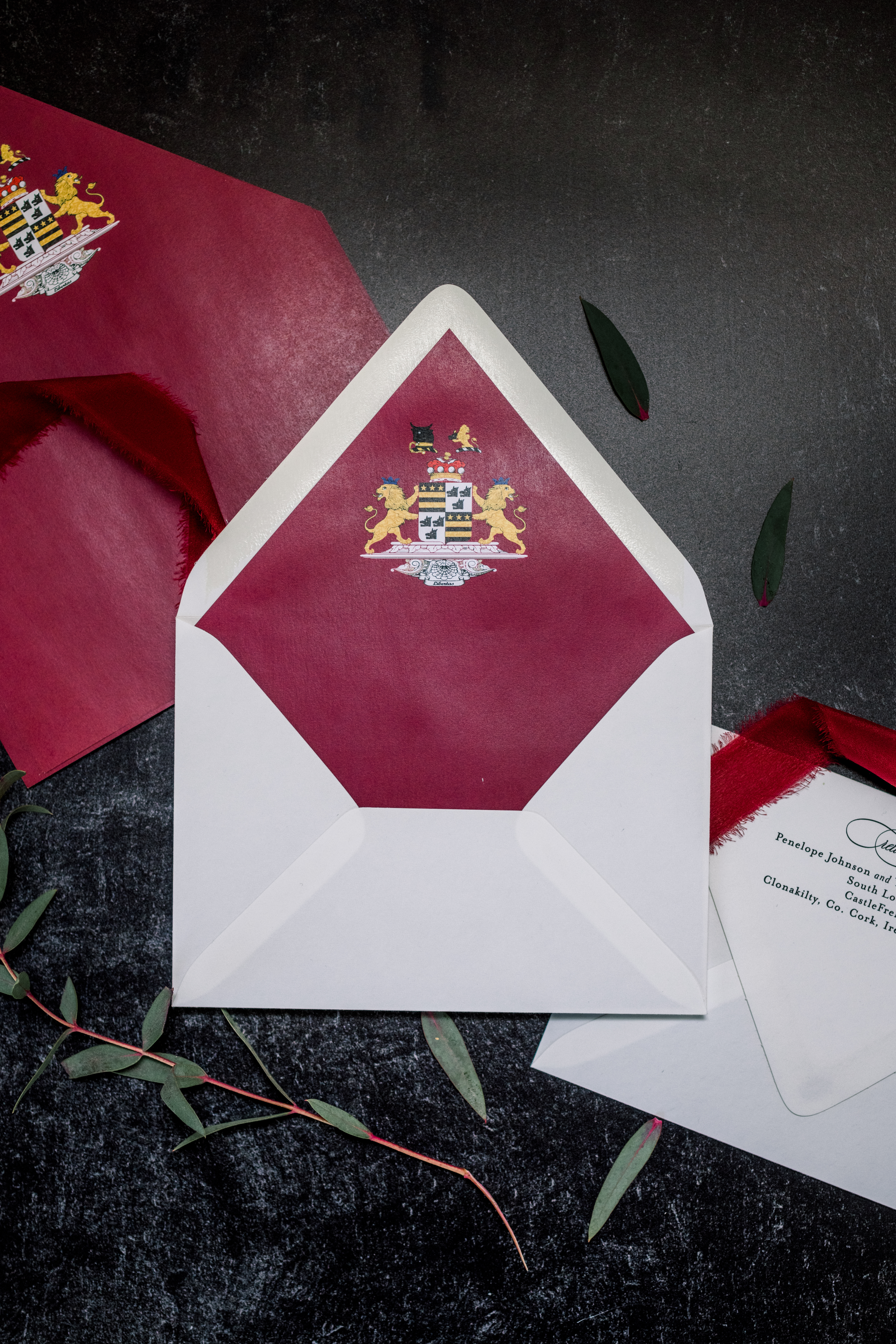
On the left, this image was taken by a professional photographer hired by the stationer. Poor lighting creates a sheen on the envelope-liner that makes the paper feel cheap and the layout doesn’t showcase the beautiful return addressing or wax seal.
After
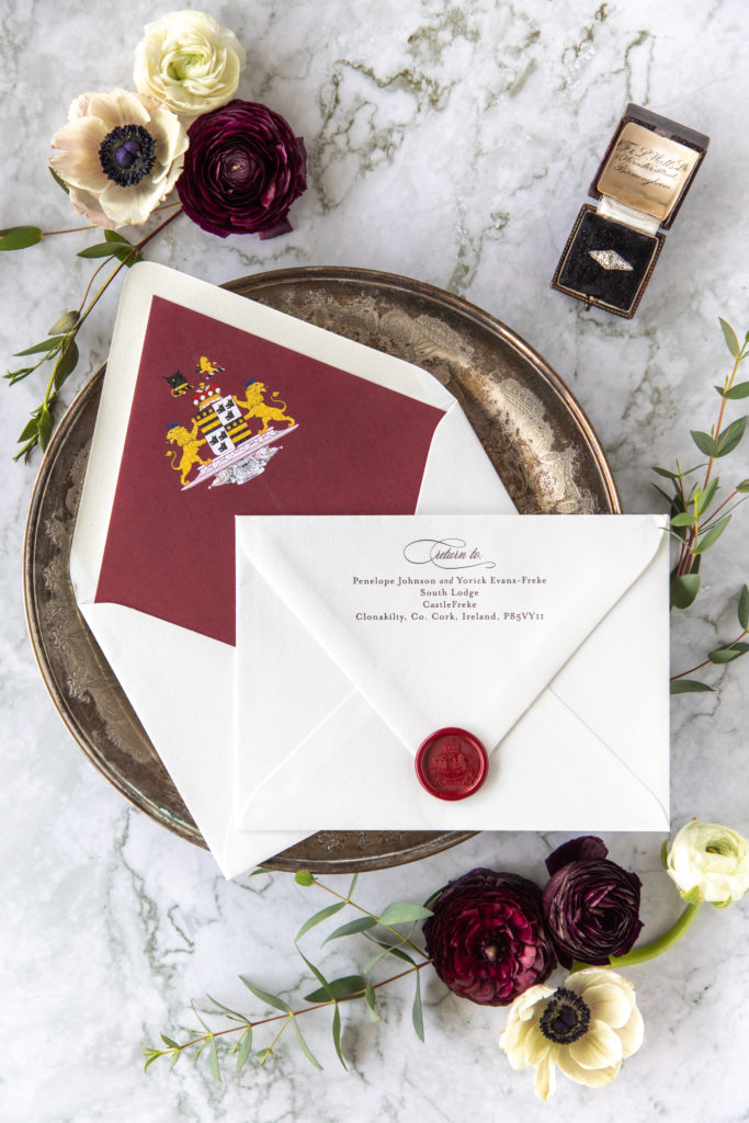
On the right, the envelope is laid out to show off the gorgeous liner, return address, and wax seal and is surrounded by florals in a coordinating color scheme against a marble backdrop that matches the stationer’s business branding. Styling by Juliana Mary, Stationery by Seventh & Anderson
Which transformation was your favorite?
I love righting the wrongs done to stationers world-wide and capturing the beauty of your paper. If you’re ready for your own transformation, check-out the upcoming Flourish Photoshoots or let’s chat about a full-custom styled photoshoot exclusively for your business.
liked this post? leave a comment!