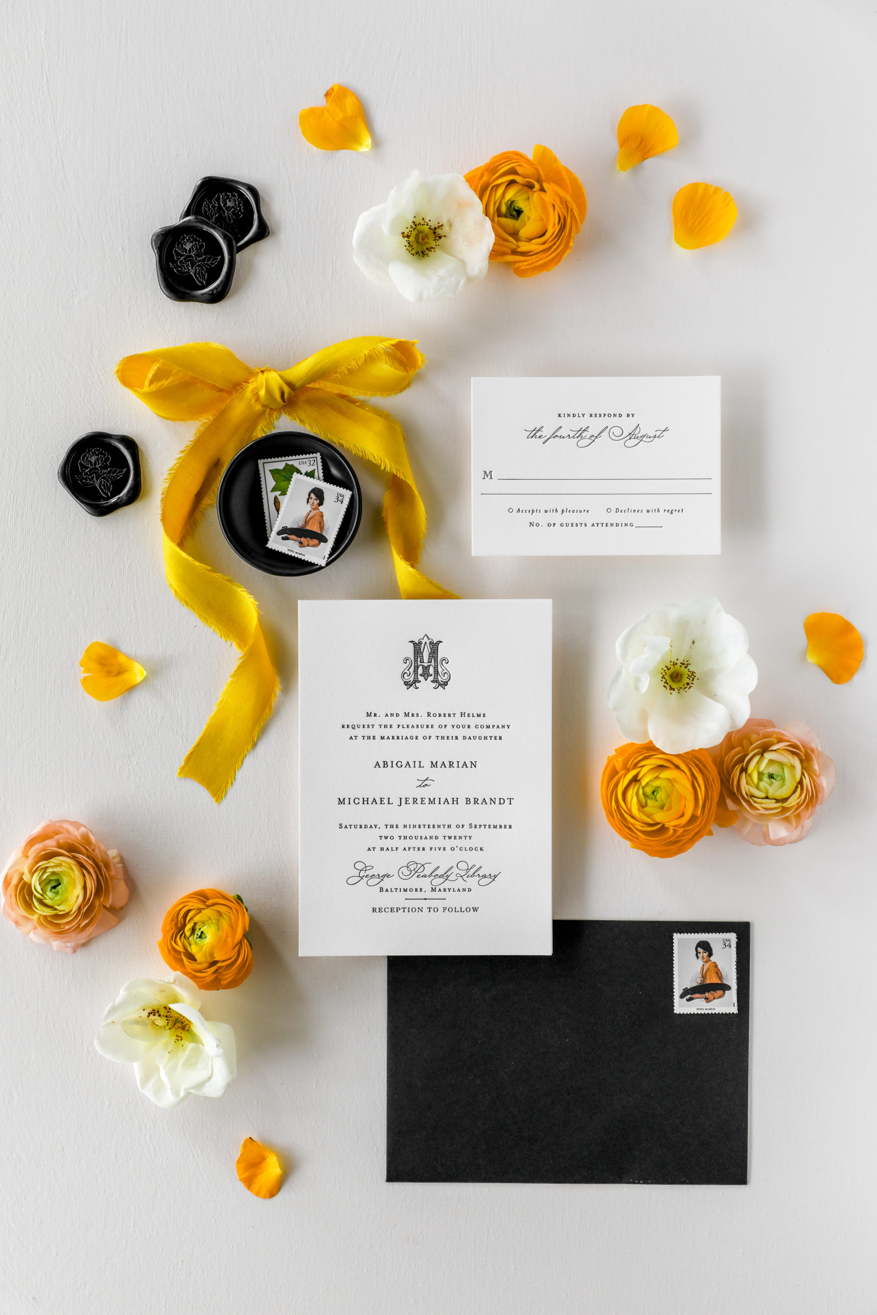
I talk a lot about the importance of defining your brand aesthetic and carving out a special niche for yourself in the market….but what if you love all the things?
I hear this a lot, and I want you to know, you’re not alone! I too, love all. the. things.
I love light and airy, I love dark and moody, I love bright and bold. I love the romance of a fine art aesthetic, I love maximalism and minimalism in equal measure (okay, that’s a lie I actually love maximalism more…but I think you get the point)
When you love all the things, narrowing your services, your designs, and your aesthetic down can be a serious challenge. So what’s a girl to do?
I’ve devised three approaches to this issue; choose the one that feels best and you’ll be on your way to a cohesive aesthetic in no time!
Just Pick One (for the ‘Gram)
I often hear from stationers that they don’t want to limit their customer base by picking just one style and I totally get that (especially when we’re thinking about suppressing our own creativity, it can feel scary to put yourself into a box!). If this sounds like you, try choosing one aesthetic that resonates most with your best clients (again, best means most profitable, most fun to work with, and you enjoyed the work you created) and focus on showing that type of work on your Instagram feed. On your website, you can showcase more styles to provide a broader range of options.
Why choose just one style for Instagram?
Think of your Instagram feed as your portfolio. Posting a lot of disparate images that don’t fit together in style or aesthetic will confuse potential new clients and your audience. You will experience more growth, engagement, and receive more inquiries if you show a cohesive group of work.
On your website, create different sections to feature each type of work you create. For example, one page for bright and modern designs, one page for clean and classic, one page for fine-art, and so on.
Just Pick One (period)
Is this groundbreaking advice? No…but it is a good place to start. If you’re having trouble narrowing your aesthetic, don’t over think it. Choose the one that feels best to you right now (best can mean a lot of things, but I think of work that you enjoyed creating and that had a good response from your audience) and go all in.
Like Picasso* you can always evolve your brand and style over time. Having one specific look and feel to your work, imagery, and copywriting at a time will give your audience a sense of security by knowing what to expect from you, plus you’ll be able to more confidently decide which new invitation suites to sell, what images to post, and how to talk about your work.
Once you feel like you’ve exhausted a specific aesthetic and style, change it to meet your current interests and trends.
*Picasso had 5 major ‘periods’ over the course of his career, including the Rose, Blue, Cubism, Neo-classical, and Surrealism periods.
Just Pick One (way to show)
If you’re in love with all the different styles that you create, instead of limiting the type of designs, limit how you show it.
Setup your brand with defined color palettes, decide how you want to present your work (lots of props, lots of florals, few props, no florals, what type of backdrop, etc.) and use your imagery to create the connections in your portfolio.
Here are some ideas on how to style your work to tie together your portfolio:
- Select 1-3 backdrops that you always use for flatlays
- Stick with styling your papers straight or organically displayed
- Get creative with lighting or shadows, make that your signature style
Creating a cohesive visual aesthetic is my speciality, so feel free to email me at hello@julianamary.com if you have questions about what this could look like for you and your brand.
Final Thoughts
No matter which option you choose, remember it’s all about your audience (not you). By presenting your work in a cohesive fashion, you will help your audience make better decisions about their paper purchase, and make it easier to know if you are the right designer for them.
If you’re still struggling with how to show your work and create a cohesive aesthetic, feel free to email me at hello@julianamary.com. I’d love to hear from you and do my best to provide personalized feedback.

liked this post? leave a comment!