Whether you’re submitting your images to an editor for publication or sending a gallery to your clients, capturing gorgeous details and stationery flatlays is an important piece to telling a complete wedding day story.
Invitation suite styling is an art, but there are rules that will help you compose the perfect flatlay every time.
Lighting
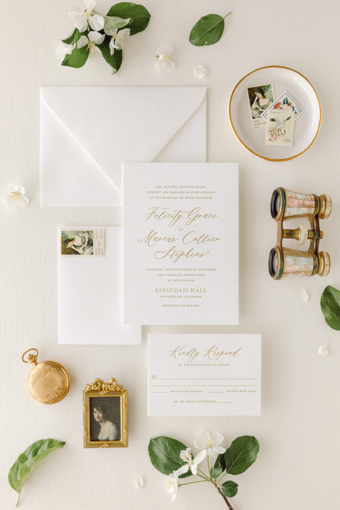
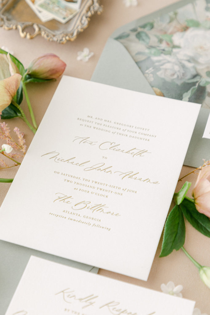
Professional photographers know that the success of an image comes down to one thing: proper lighting. Whether you’re capturing a portrait, landscape, or product (like stationery) the right light can make or break an image. When photographing stationery on location, look to setup your flatlay in natural, indirect sunlight to minimize harsh shadows and retain true-to-life colors.
High end weddings will often embrace beautiful details like handmade paper, foil stamping, or calligraphy which can be difficult to capture when the light is too harsh.
Hero
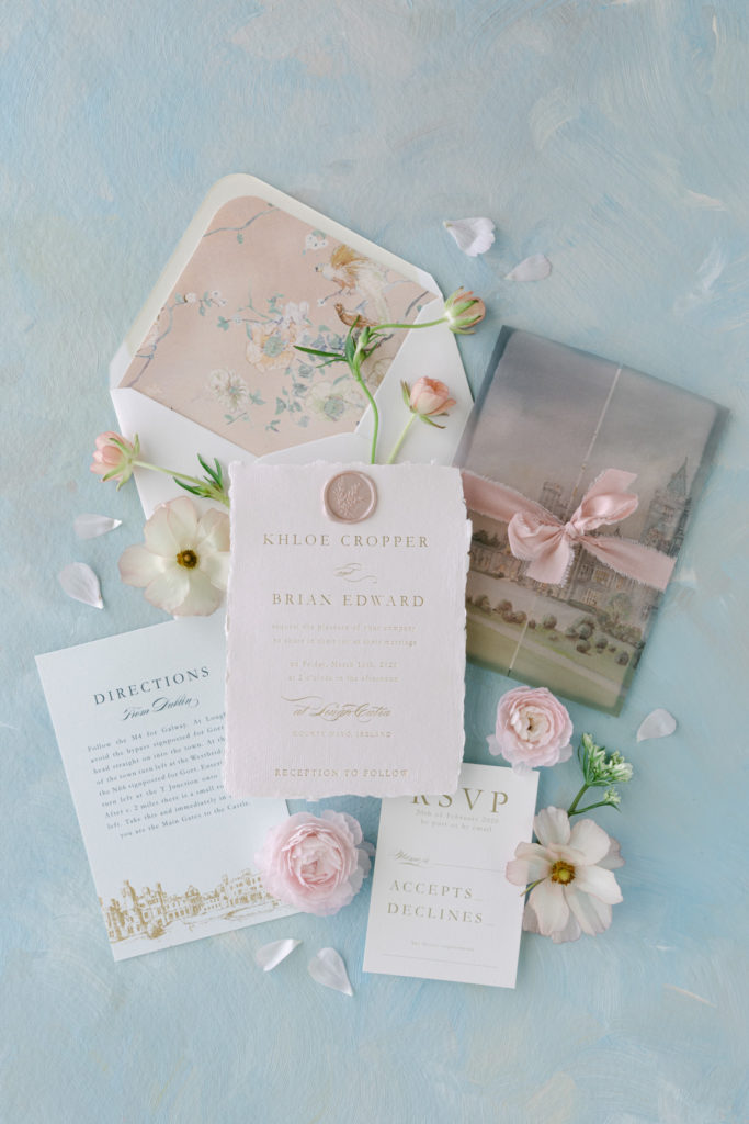
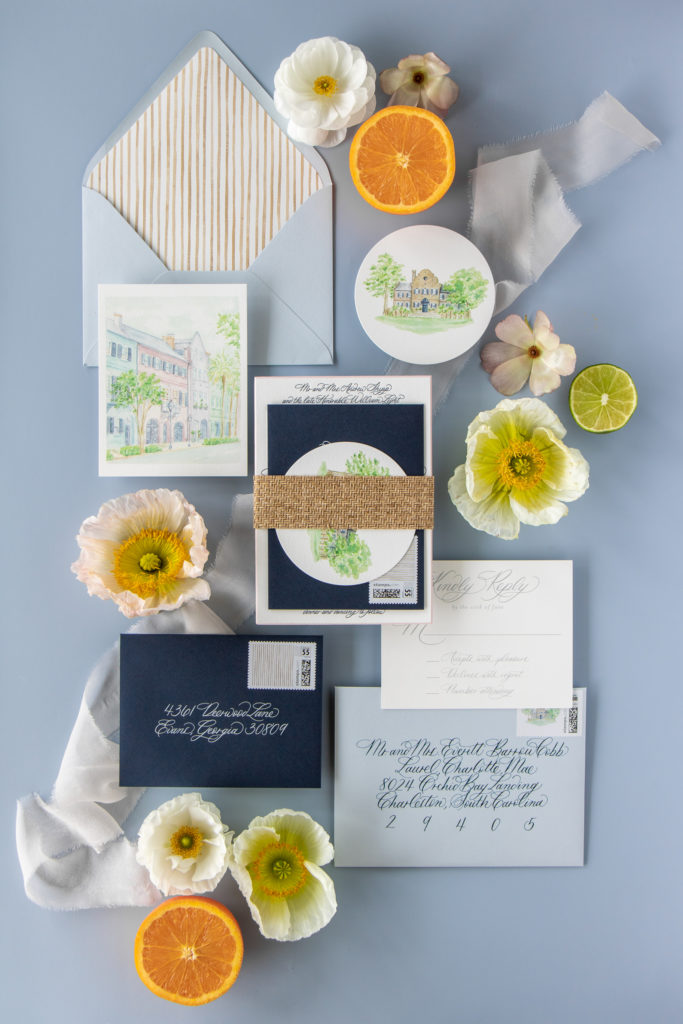
When styling the invitation suite, decide which piece is going to be the hero of your shot and give it the special placement it deserves. Most likely, this will be the main invitation but it could be a beautiful envelope, hand-painted illustration, or another special piece. Place the hero at the center of your image and supporting pieces and props thoughtfully adjacent.
Leading Line
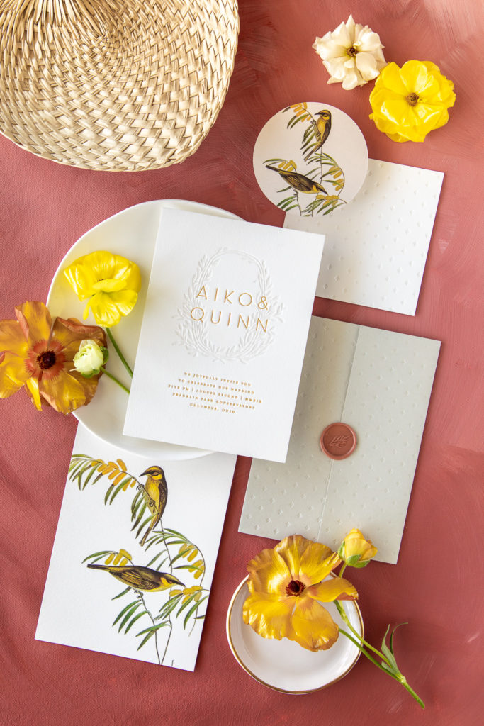
Leading lines are lines that appear in a photograph that have been framed and positioned by the photographer to draw the viewer’s eye towards a specific point of interest. In portrait or landscape photography, the leading line is often an obvious marker in the scenery like a river, coastline, staircase, or road toward your subject. In flatlay photography, you create the leading line through thoughtful prop placement and floral arranging.
In the image below, a carefully placed lemon at the bottom left points up toward the invitation suite which is styled on a diagonal that extends to the top right corner with the yellow ring box and florals.


liked this post? leave a comment!